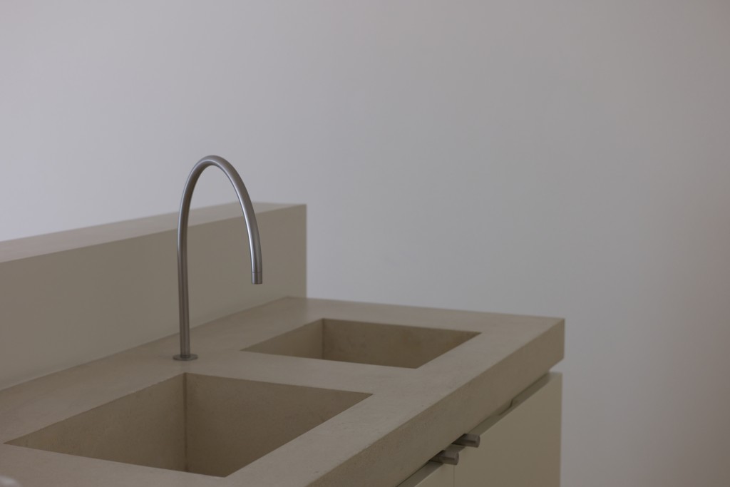
Minimalists ask the question: How much can you strip away from an item — painting, sculpture, building, furniture — without losing its essential purpose and identity?
Your projects don’t have to look like John Pawson’s Home but applying a minimalist frame of mind to design and construction drawings can lead to a reduction in the number of change orders during the contract administration phase.
“That which is less complicated is often better understood and more appreciated than what is more complicated; simplicity is preferable to complexity; brevity in communication is more effective than verbosity.”
Negative (white) space is important
Planning a drawing set ahead, for example by cartooning, leads to a drawing set that is simple, clear, and coordinated. Organized tender drawings usually provides bidders with a first impression that the project will be straightforward to build with few surprises.
It is guaranteed, that the minute a bidding contractor sees a crowded, confusing and unorganized set of drawings, they will be including extra contingency in their bids to deal with the risk of uncertainty and will begin contemplating change orders before the project even starts.
Every detail counts
Poor or no coordination of the architecture drawings with that of the Engineering consultants is often cited as the major source of change orders. What does that line or square on the drawing represent? What is the structural or mechanical consultant proposing? What could be worse than unintentionally having a wall mounted flush valve locker room toilet installed in that high end condominium project that the engineer copied from the last project without paying attention. Or the all to common mechanical diffuser in conflict with the electrical light fixture.
Questioning and understanding how the different equipment and systems integrate with the architectural design will naturally reveal problems that might come up during construction avoiding those costly changes that result in value engineering. Who knows, it may even lead to a beautiful detail in an unexpected place.
Omit needless things
Do you read the general notes as part of your mark-ups? How often do general notes appear that apply to one project and not the other? Does the elevation that is used to describe the slope of the interior ceiling still show an outdated concept for the cabinetry that can be seen beyond?
It is all too common to find something dimensioned in more then one location in a drawing set. If the dimension changes, most often then not, all the instances of the change are not caught. (Mind you, this is improving with BIM.)
Does the elevation design have to have 10 different window styles which equates to 30 plus different head, jamb and sill details? Can there be a commonality in the detailing of the elements, sizes, proportions, etc.? Even in many historical architectural styles one can see a repetition of elements, proportion, and symmetry that leads to a timelessness of design.
Keep these minimalist principals in mind at the start for improved construction drawings and less change orders at the end. Need we say more?
We also thought you might also enjoy this short video we found of John Pawson describing the design of his home.
Terms of use: This work is licensed under a Creative Commons Attributions License CC BY-ND 2.0. The photo used at the start of this post is attributed to Nicolas de Camaret and the original version can be found here.


